How To Design A Logo (Other Designers Will Wish They Designed).

& A (Fancy) Cheat Sheet.

By Becka Gruber

brandr /Illustration by Becka Gruber / Get Em Tiger

The term “branding” comes from an Old Norse word “brandr” or “to burn”, actually meaning “to mark by fire”. It’s in reference of the practice of branding livestock/ “mark permanently with a hot iron.”

Below is my logo design method. I don’t believe many designers talk about their methodology too openly. It’s probably because method is something that takes years of experience to put together.

I once had a college professor tell me “I will tell you some design things, but not all design things- because I could be pitching design against you one day”. It never set well with me. Not so much that he was withholding information (even though I was paying a premium for his class), it was his fear I disliked. I think that knowledge is powerful and can be built upon and should be shared openly with dialogue. So I am going to share my Brandr Method, and I’m not going to ask for money or your email in exchange for it.

I formulated the Brandr Method on the back of a design degree, loads of client work, working at many agencies, reading many books and articles on logo/ brand design, watching loads of videos, going to conferences, as well as talking to other designers, and leading other designers in their process. All of these contributed to the creation of the Brandr Method.

Things to Keep In Mind:

These items should be like background noise when you determine what approach you are going to take with the logo:

Discovery Phase:

Of course I advocate an in-depth Client Discovery Phase. Companies see a big return for hammering out culture and brand guidelines. Keep your clients vibe at the front of your thinking. The logo should reflect THEIR company (not you as a designer). Sometimes when doing client work, I make a playlist on Spotify that reminds me of what that client feels like/ keeps us in the right mood.

Make a playlist on Spotify that reminds you of your design project: to get you in the mood for that style of work.

Differentiator:

Logos should have a meaning behind them that conveys the businesses differentiator. How is this company different from others that offer the same service? What sets them apart? Highlight that difference visually. The cheat for this is creating a tag and dropping it under the logo — but if the logo is well designed it can speak visually/ compliment the differentiator as well.

Application and the Pencil Test:

Logo On Pencil /Illustration by Becka Gruber / Get Em Tiger

Where is this logo going to be used most of the time? Of course logos should be dynamic and suitable for mobile apps, websites, flyers, shirts — but it also needs to be able to have legibility if it were only in one color and printed (small) on a pen or pencil. Thus, an “illustration” won’t work as a logo. App icons and social media profiles are small in size but flexibale in color and can retain more pixel data. 

 A pencil is the least forgiving (printing crudely on a thin piece of wood) so that’s always been my mental “go to” test. Know the anatomy of a logoLogos need to be a simplified mark. Some applications include very large format (bus, plane, or billboard for example). The logo may end up in a intro or outro. These types of logos that require animation can’t be flat. They need movement built into them. Keep these things in mind to “test” the strength of your logo and branding solutions.

MAKE A BRIEF TO KEEP YOU AND YOUR CLIENT ON TRACK.

We have multiple methods for this. The most simple is the use descriptive word clouds — or, for more intensive jobs, mind maps (more important the word the larger the real-estate it receives). These briefs show the words that are descriptive of the company. The logo design should reflect the same words that describes the company. For example, if you had a cutting edge photographer, a feminine flower logo would NOT be a good solution, no matter how much that photographer likes flowers. If your client disagrees on what you prescribe (and your prescription has sound logic and matches the agreed brief), you need to know ahead of time if you will put work out that makes no sense- or if you would sever ties with the client. That being said the client is the expert in their line of work. So collaboration is critical. This process should not be about “being right” but truely finding the best solution.

GET OUT YOUR SKETCH PAD.

Keep it practical before you go digital.

Sketching is critical so you don’t create a logo that looks like the million other logos out there.

A logo should be a unique identifier. If it looks like a replica of another company there is no point in having a logo.

Some designers go straight for the computer — I call that pixel pushing. They just “move” stuff around until it “looks okay”. That’s not strategic. It’s not a solution. It’s not really even functioning design.

Have a method (like the Brandr Method) that you go through before you begin sketching.

Brandr Method

The process I do (mentally) before I begin sketching is targeting my approach of what the logo structure aproach will be like.

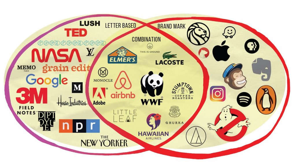
There are basically three approaches to logo designs: Letter Based, Brand Based or Combination Based.

Below are the three descriptions of these types of logos, and notes when to use which approach.

Letter Based, Brand Marks, & Combination Logos /venn diagram by Becka Gruber / Get Em Tiger

LETTER BASED LOGOS

WHAT A LETTER BASED LOGO IS:
The company’s name in styled text.

A study of top 100 brands showed that almost 40% are word marks (text only).

WHEN TO USE THE LETTER BASED APPROACH:

  • If the company has a great name (catchy with a ring to it), OR is named after an individual.
  • If the company name was “made up”: sometimes companies smoosh together two words for a name — you do NOT want an abstract illustrative logo for this. The name is already abstract. So a word mark would be a great solution to really emphasize and drive home the name.
  • The use of letterforms/monograms/abbreviations can simplify complicated/long names as a mark, making them fit better in a variety of space and be more easy to perceive, both phonetically and visually.

LETTER BASED LOGOS SHOULD ALWAYS BE:

• Legible

• Distinctive

• Custom Font

LETTER BASED APPROACHES CAN INCLUDE:

• Monograms

• Abbreviations

• Mnemonic devices/acronyms

• Letterform approaches

Sometimes designers use a carrier shape around the logo (circle, square, etc).


BRAND MARKS

WHAT A BRAND MARK IS: 
An immediately recognizable image that has been stylized. These are the opposite of letter based logos. Brand marks are symbols without words.

You have to be a relatively good illustrator to tackle this approach.

WHEN TO USE THE BRAND MARK APPROACH:

  • When the name is an immediately recognizable literal image that can be stylized creatively and simplified
  • When you need to convey a big idea, or provide strategic ambiguity, or when there is a lot of divisions in a company (the Nike Swoosh for example implies movement)
  • When a character can represent the company values or convey an idea (the Snapchat ghost represents what the product provides)

BRAND MARKS SHOULD ALWAYS BE:

• Simplified

• Memorable enough someone could “sketch” it after seeing it.

BRAND MARK APPROACHES CAN INCLUDE:

• Pictorial approach (symbol)

• Abstract

• Mascots


COMBINATION MARKS

WHAT A COMBINATION MARK IS: A word mark and brand mark together in a “locked” position. I have heard many designers refer to these as “lock ups”.

Sometimes a Brand Mark originated in a Combination Mark, but the company gets so well known they omit the Word Mark in most cases.

WHEN TO USE THE COMBINATION MARK APPROACH:

These are always a great solution because they cover all bases. They just require more work, so they need quoted as such. You need to allocate much more time. These are also are good for cases where multiple company brands, partners, affilates or subdivisions will need “locked” together.

Emblem based (badges) can also fit into the combination category. Emblems are often used by universities, social organizations, and government agencies. They function great on package design. Emblems are less versatile than brand or letter based marks. Due to small details emblems can become illegible when placed on small surfaces (pencil or app icon etc.).

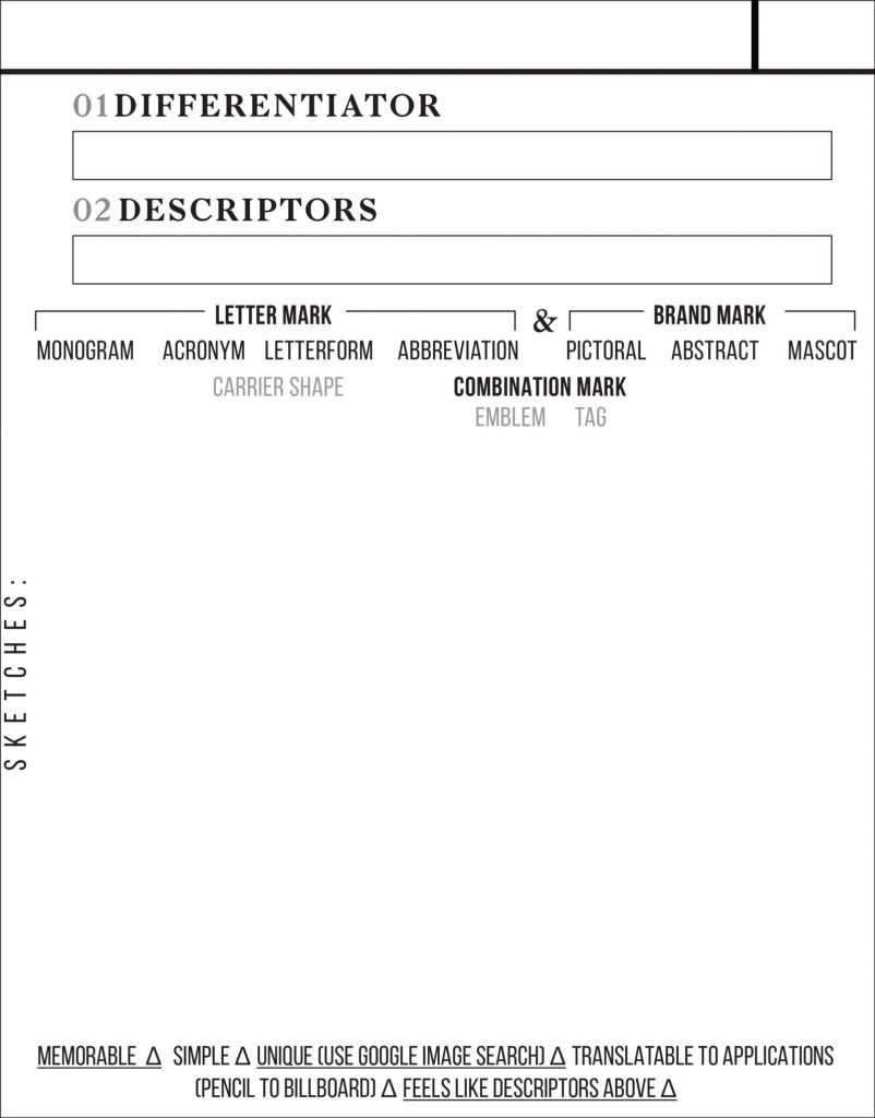
Walking a client through the Brandr Method is made easier with the cheat sheet below.

I advocate showing clients rough sketches first, before perfecting a design with a pen tool. Take the time to explain your thought and work flow process (so they understand the value and solution) you are providing.

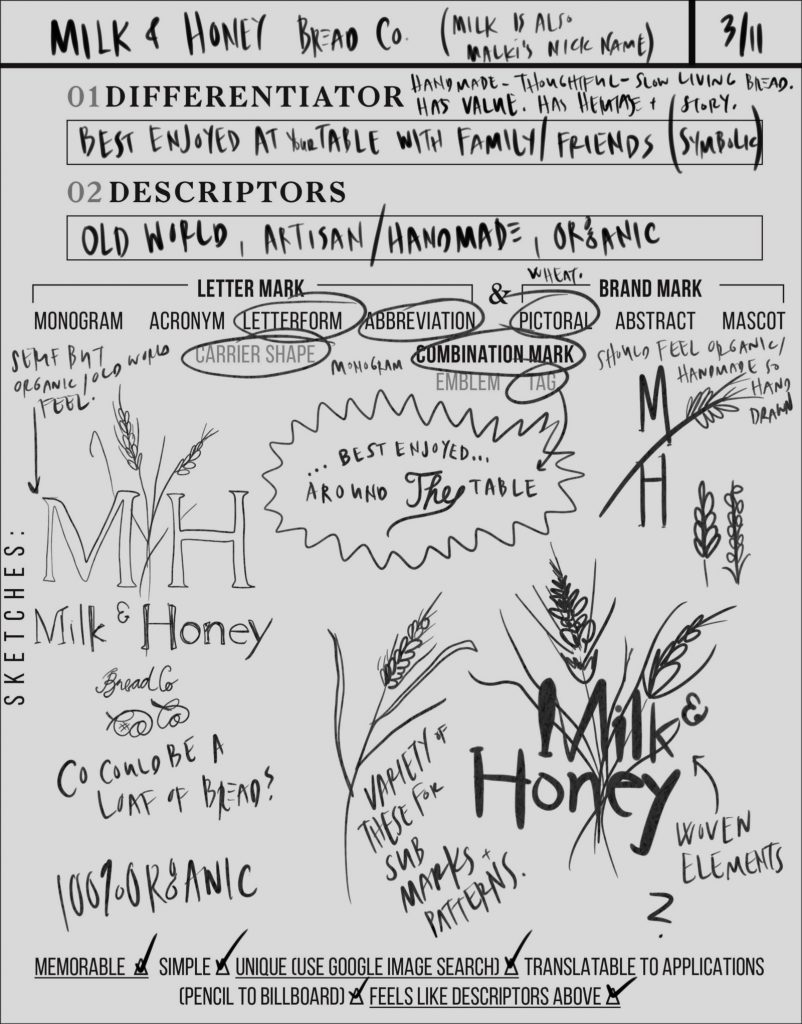
EXAMPLE BRANDR CHEAT SHEET FILLED OUT:

Brandr Cheat Sheet (Milk & Honey) Example / by Becka Gruber + Ashley Purser / Get Em Tiger

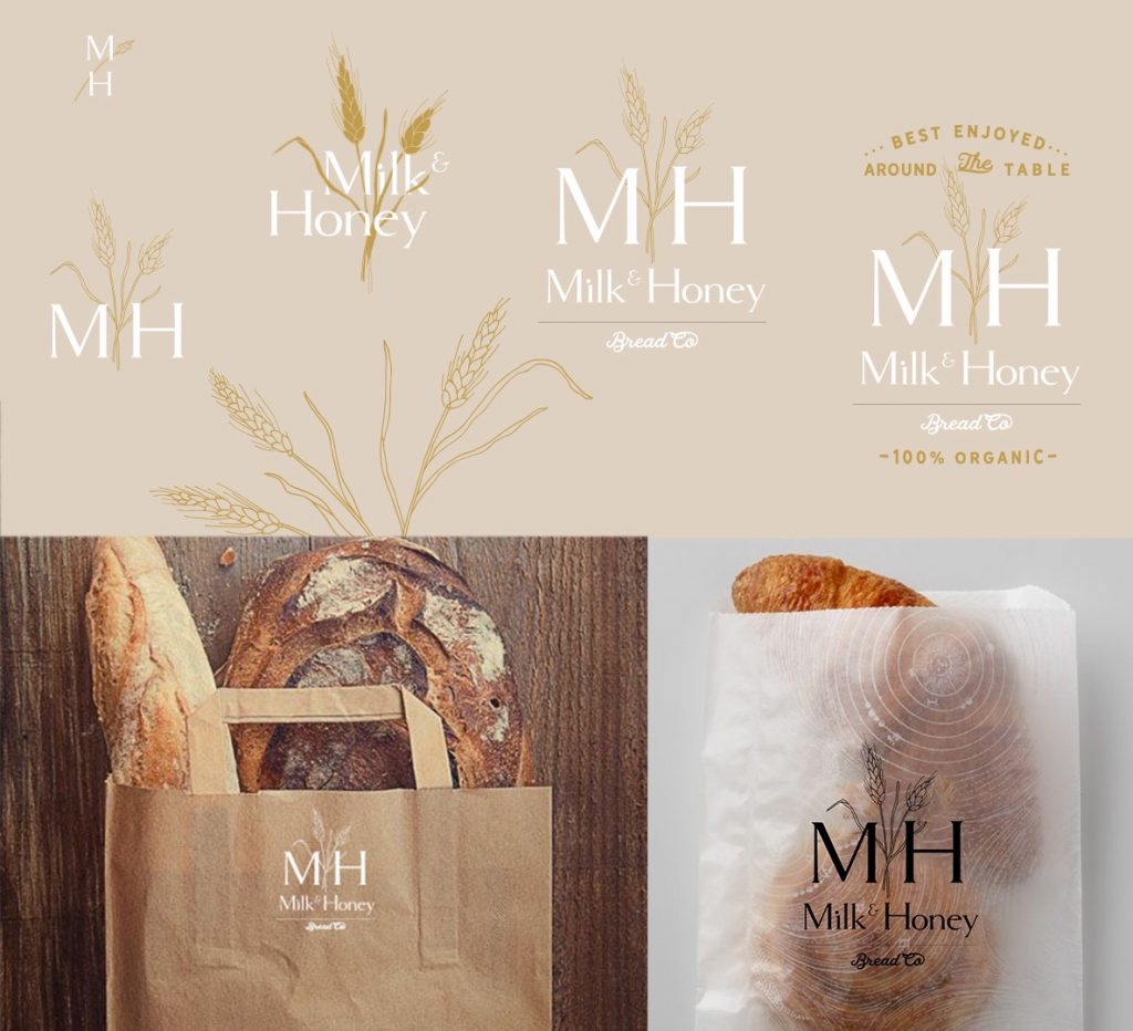
Milk + Honey Bread Co / by Becka Gruber + Ashley Purser / Get Em Tiger

By Becka Gruber

& BLANK BRANDR SHEET

Ofcourse, I’d love a response/ comment below with a link to your process & work using the Brandr Method. I want to 👀 those logos.

It’s a one click (safe) sign up for Medium. For my friends who haven’t joined the platform.

If this was useful to you give me a clap 👏 or two.