Logos play a huge role in the perception of your brand in the marketplace. Logo originality and having a clear concept is key to standing out from hundreds — if not thousands — of competitors and allows you to be uniquely identifiable. If your logo is not unique, it basically defeats the purpose of having a logo. If a logo doesn’t resonate with your target audience or capture the essence of your brand, it’s possible you’ll lose them before the first click.
If your company is creative, your logo should be, too.
If your business is minimalistic, your branding should be also.
If your product is smart, your logo should echo intelligence.
Stay away from trends. Text boxes, flowers, and hands can really date your logo in 2019. Just like all “badge” logos that originated circa 2009. Admitedly, there are some REALLY cool looking badge logos and hand logos out there, (that are very custom). Those are fine. Trends work great for illustrations, but not for an item that will be with you in the long haul (logos).
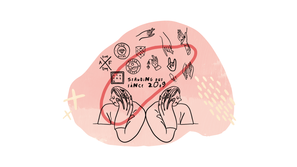
“Say No” (to a trendy logo) / Illustration by Becka Gruber / Get Em Tiger
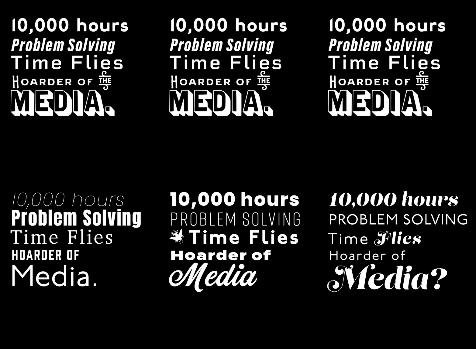
Logos that are hand drawn? Those are a big yes! Logos that you can type out by purchasing as a font? Big no. A FONT IS NOT A LOGO. If you are paying a premium for a logo, be wary of an agency or designer that doesn’t start off with a sketch. All logos should still translate in black and white and be minimal enough to fit on a pencil (small real estate area) clearly.
A font is not a logo.
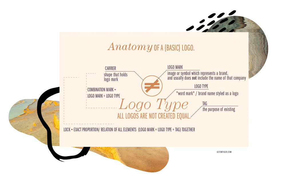
Here is the anatomy of a basic logo:
Types of Logos:
Living/generative logos constantly change, based on code or an algorithm, for predetermined situations.
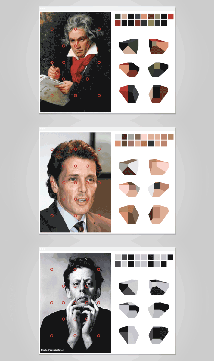
Casa da Musica comprehensive identity /by Sagmeister Walsh
Responsive logos adapt to different device screen sizes — you will notice a full logo on the corner of a website often “collapses” to a shortened/smaller version when you scroll down.
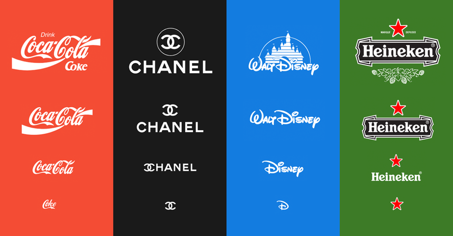
Responsive logos / Coca-Cola, Chanel, Walt Disney, Heineken
Variable logos are where aspects or pieces of the logo change depending on the marketing campaign (i.e., music styles or composers).
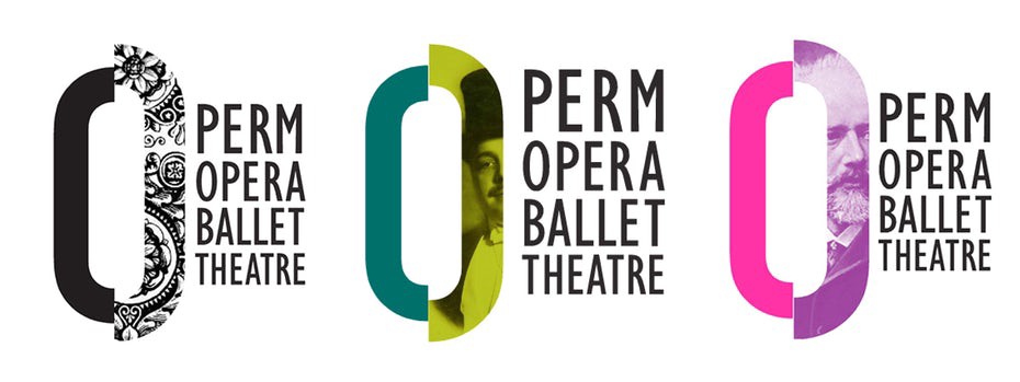
59 page branding book Пермского театра оперы и балета (краткая версия) for Perm Opera Ballet Theatre — (https://issuu.com/permopera/docs/brandbook_permopera)”
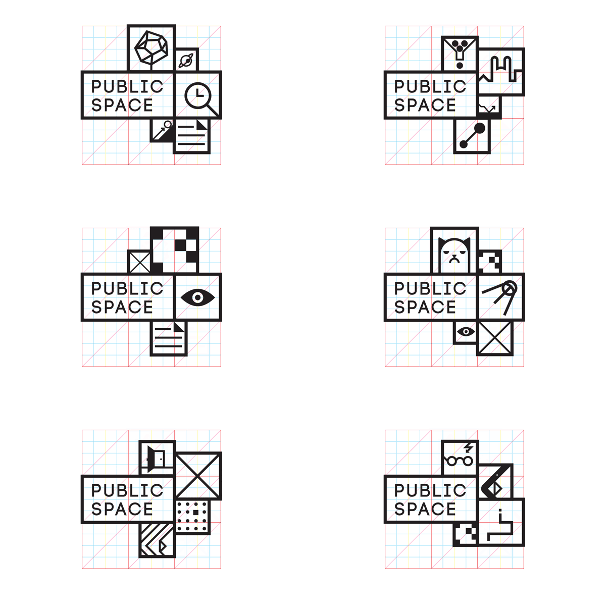
Via Public Space
Now more than ever, logos are viewed on a multitude of platforms and, in some cases, different market segments. In order to build an even stronger connection to specific groups, logos need fluid interchangeable elements, varied enough to fit in horizontal or vertical, web, collapsed web, app, printed, social and animated environments. Businesses can also better optimize their branding based on where the logo is displayed.
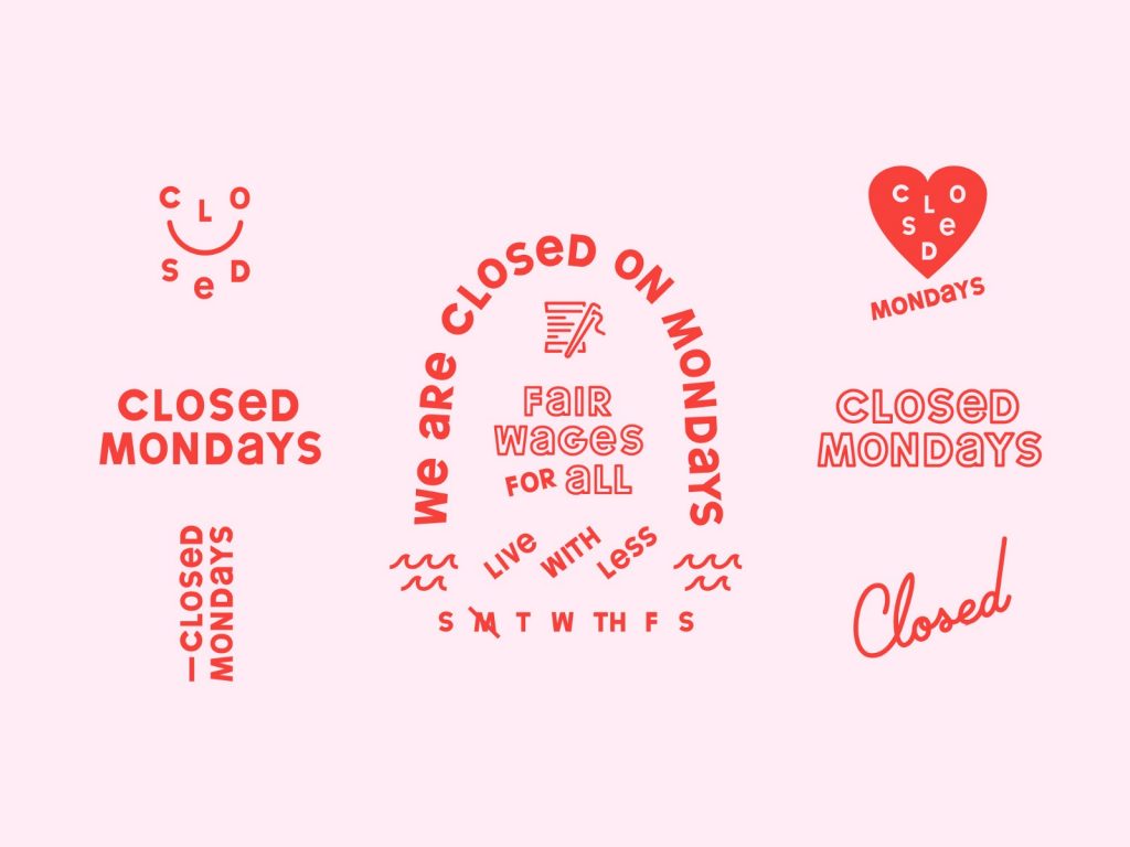
Via Closed Mondays
Logos in 2019 are all about the elements working together. Note the typography, color and element consistency. Be careful not to stray too far, with too many elements — or risk losing visual cohesiveness.

Via London Football Exchange — Responsive Brand by Emir Ayouni
By Becka Gruber
